50 YouTube Thumbnail Ideas That Get Clicks (by Niche, 2026)
The best thumbnail ideas come from what already clicks in your niche, not from a template gallery. Below are 50 of them: five each for digital marketing, education, vlogs, teachers, artists, animators, tech, fitness, cooking and podcasts, with the pattern behind every set. YouTube says half of all channels sit between 2% and 10% impressions click-through rate, so one extra point on CTR is a real gap to close.
Treat each idea as a starting shape. Before you build one, look at what is already winning around you: Thumbnail Search pulls up thumbnails from videos that beat their own channel's average, filtered to your niche, so you copy a proven structure rather than a guess. The complete guide to the thumbnail generator covers the full workflow; this post is the idea bank.
What makes a good thumbnail?
A good thumbnail does one job: it makes a stranger decide, in under a second, that this video answers something they care about. It has one subject, one legible emotion or result, at most four words of text, and enough contrast to separate from the thumbnails next to it. Everything else is decoration, and decoration costs clicks at feed size.
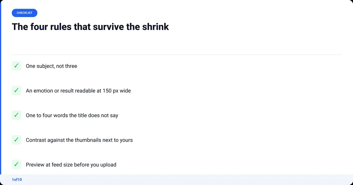
- One subject. A face, a product, a dish, a diagram. Not three of them.
- Emotion or result you can read at 150 pixels wide. Subtle does not survive the shrink.
- Text of one to four words that adds what the image cannot say. The title carries the rest.
- Contrast against your neighbours. Whatever your niche does with color, check what the opposite looks like.
The ideas below apply those four rules to ten niches. For the design mechanics (fonts, spacing, crops) see YouTube thumbnail design.
Digital marketing thumbnail ideas
Marketing audiences are sceptical by trade. They click proof, and they can smell a mocked-up screenshot.
- The dashboard number. A real analytics screenshot with one figure cropped large: the spend, the result. Crop, do not blur.
- Red X on a popular tactic. An icon for the tactic, a red cross through it, two words: "Stop this."
- Before and after funnel. Left side, a flat line. Right side, the same chart climbing. Hard vertical split.
- Cost per result. A dollar figure next to the thing it bought. "$3 a lead" beats "cheap leads".
- Screen plus your face. The result on a laptop screen, your reaction beside it, screen kept large enough to read.
Pattern: every idea shows a number or an outcome, never a concept. Keep the figure exact; round numbers read as invented.
More examples and the reasoning behind them: digital marketing thumbnail ideas.
Educational video thumbnail ideas
Education thumbnails sell the gap between what the viewer knows now and what they will know after.
- The one diagram. The single drawing the whole video explains, redrawn clean, one part highlighted.
- Misconception crossed out. The common wrong belief as text with a strike-through, your face unconvinced.
- Difficulty meter. A three-block bar (easy, medium, hard) with the topic sitting at the hard end.
- Two-point timeline. "Day 1" and "Day 30" with the visible change between them. Never more than two points.
- The exam question. A short question with the answer left blank, laid out like a test paper.
Pattern: show the question or the diagram, hide the resolution. The curiosity gap does the clicking, not the color.
More examples and the reasoning behind them: educational video thumbnail ideas. Or build one with the Education Thumbnail Maker.
Thumbnail ideas for vlogs
Vlog viewers click a person they recognise in a situation they did not expect.
- The one unusual moment. Not the overview of the day. The single strangest thing that happened.
- Location with you small. A wide shot of the place, you as a small but clear figure. The setting sells the story.
- Milestone number. Your face plus a number: days, subscribers, kilometres.
- Distress, not triumph. You mid-problem: flat tyre, missed flight. A raw photo beats a polished one here.
- The update statement. Three words and your face: "I moved out." "It went wrong."
Pattern: candid beats posed. A lifestyle shot that looks produced reads as an ad, and the feed skips ads.
More examples and the reasoning behind them: vlog thumbnail ideas. Or build one with the Vlog Thumbnail Maker.
Thumbnail ideas for teachers
Teacher channels compete with the textbook, so the thumbnail promises the shortcut.
- Whiteboard close-up. A worked example half finished, one step circled.
- Grade jump. "C" to "A" with an arrow. Two characters, huge.
- The common mistake. A wrong answer in red pen next to your face.
- The 60-second version. A clock icon and the topic, promising speed.
- Classroom object as prop. A real textbook, ruler or lab item held to camera, oversized in frame.
Pattern: faster, clearer, or the mistake the textbook never warns about. Pick one promise per thumbnail.
More examples and the reasoning behind them: thumbnail ideas for teachers.
Thumbnail ideas for artists
Artist thumbnails win on the work itself, so the usual mistake is covering it up.
- Finished piece, full frame. No text. The quality of the work does the selling.
- Progress split. Sketch on the left, finished piece on the right, same subject, same crop.
- Materials flat lay. Five tools on a plain surface, one of them picked out with light or color.
- Extreme detail crop. A two-centimetre section blown up until the brushstrokes show.
- Time stamp. "40 hours" over the finished piece and nothing else.
Pattern: if you add anything to the art, add one number: hours, price or size. Never a sentence.
More examples and the reasoning behind them: thumbnail ideas for artists.
Thumbnail ideas for animators
Animation viewers want to see the craft, and one frame with real appeal beats any marketing.
- Single expressive frame. Your character mid-emotion on a clean background.
- Rig reveal. The character split down the middle: rendered on one side, wireframe or rough keys on the other.
- Rough to final. A pencil-test frame next to the finished frame, same pose.
- The impossible squash. One exaggerated in-between that looks broken. Curiosity does the rest.
- Tools shot. Tablet, pen and the character on screen, with the software UI cropped out.
Pattern: show one frame and the process gap behind it. A busy timeline screenshot turns to noise at feed size; leave it in the video.
More examples and the reasoning behind them: thumbnail ideas for animators.
Tech thumbnail ideas
Tech buyers click a clean product shot and a verdict cue. They are comparing, so give them something to compare.
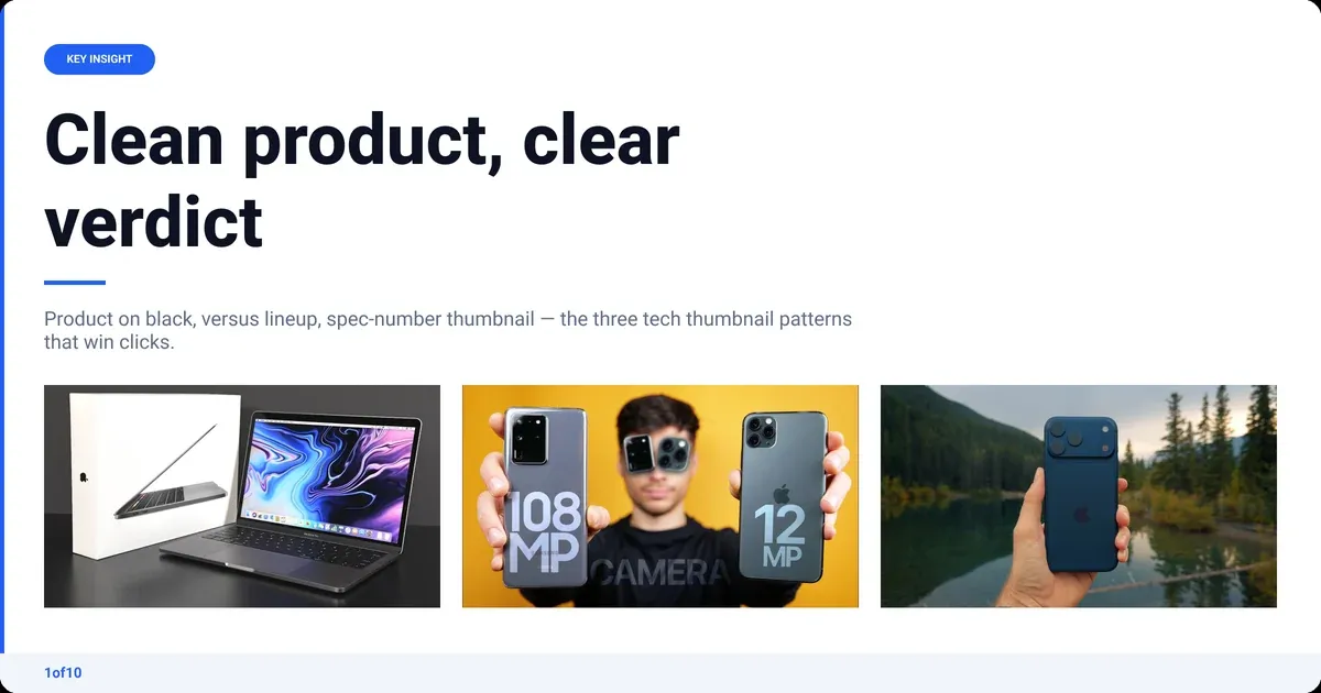
- Product on black. One device, lit from one side, nothing else in frame.
- Versus lineup. Two devices with "vs" between them, same scale, same angle.
- Teardown fragment. The device open, one component pointed at.
- Spec number. "2 TB" or "48 MP" as the only text, the device beside it.
- Verdict face plus product. You holding it; your expression is the review.
Pattern: match the lighting of the product photos in your niche's outliers. A phone snapshot next to studio renders loses before anyone reads the title.
More examples and the reasoning behind them: tech thumbnail ideas. Or build one with the Tech Thumbnail Maker.
Fitness thumbnail ideas
Fitness viewers click bodies and numbers, and the before-and-after split is the format the niche is built on.
- Before-and-after split. Same person, same pose, same light, two dates.
- The one exercise. A single movement frozen at its hardest point.
- Days count. "30 days" and the result photo.
- Wrong form, right form. Red X and green tick on two poses.
- Meal plate overhead. What you ate, shot from above, calories as the only text.
Pattern: keep pose and lighting identical across any comparison. The moment it looks staged, the niche calls it fake in the comments and stops clicking.
More examples and the reasoning behind them: fitness thumbnail ideas. Or build one with the Fitness Thumbnail Maker.
Cooking thumbnail ideas
Cooking is appetite plus ease. Show the food at its most eatable, then lower the effort with one word.
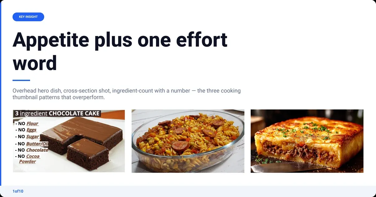
- The hero dish, overhead. Finished plate, natural light, no text.
- The cross-section. Cut it in half: the crumb, the yolk, the layers.
- Ingredient count. "3 ingredients" over the raw ingredients laid out.
- The pull or the pour. Cheese pull, sauce pour, honey drizzle, frozen mid-motion.
- Fail plate. The burnt or collapsed attempt next to the fixed one.
Pattern: the one word is always about effort: cheap, fast, three, one pan. Flavor words do nothing at feed size.
More examples and the reasoning behind them: cooking thumbnail ideas. Or build one with the Cooking Thumbnail Maker.
Podcast thumbnail ideas
Podcasts have a specific problem: the same two people every week, so the thumbnail has to carry the episode, not the show.
- Guest and host, two heads. Both faces large, same crop, eye contact with the lens.
- The quote card. Five words from the episode, the guest's face small in a corner.
- Topic object. One object that stands in for the subject: a passport, a syringe, a key.
- Episode number and name. Big number, guest name, one fixed layout every week.
- Reaction still. The host's face at the exact moment the guest said the thing.
Pattern: vary the object and the quote, keep the faces and layout consistent so the show is recognisable in the feed. YouTube also accepts a 1:1 thumbnail for podcast playlists, so build a square-safe version.
More examples and the reasoning behind them: podcast thumbnail ideas. Or build one with the Podcast Thumbnail Maker.
How do you find thumbnail ideas that already work in your niche?
Pull 10 to 20 outlier thumbnails from your niche (the free thumbnail downloader saves them in HD), lay them side by side and read the structure: face or product, text or no text, warm or cold, result or question. That grid is your audience's revealed preference, and it is a better brief than any list, including this one. It takes about 30 minutes the first time and 10 on the next video.
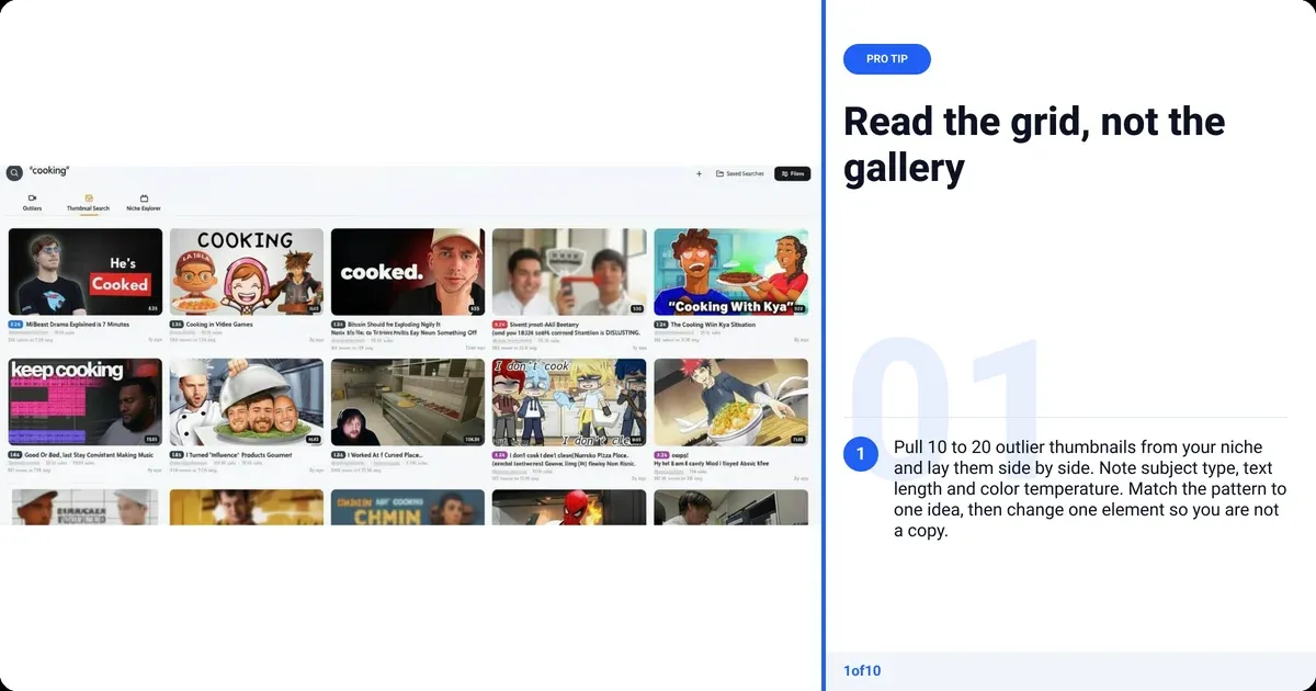
- Find the outliers: videos earning far more views than the channel's usual. Thumbnail Search does this across 1of10's outlier database, filtered to your niche.
- Note the pattern across the top 10: subject type, text length, color temperature, face or no face.
- Match it to one idea above, then change one element so you are not a copy.
- Check Thumbnail Winners inside the app: real A/B test winners from other channels, with the measured CTR change, so you see which of two similar thumbnails actually won.
Search is on every plan (Free shows the top 5 results). If you want the options built for you, the thumbnail generator takes an outlier as the reference and returns thumbnails in that structure with your subject. Generation uses AI credits, which every plan includes; searching never does.
How do you test which thumbnail idea wins?
Use YouTube's own test. Test and compare runs up to three thumbnails (or title and thumbnail pairs) on one video, splits impressions between them and picks the winner on watch time share, not CTR. Tests take a few days and up to two weeks. It is desktop only, needs advanced features enabled, and does not run on Shorts, Premieres or made-for-kids videos.
- Pick two ideas from the same niche pattern, not one safe and one wild. You learn more from a fair fight.
- Upload all three at publish, not after. Retrofitting a test onto an old video works but starts from that video's cold audience.
- Leave it. Pulling a variant on day one throws away the only impressions that came from a cold audience.
- Log the winner's structure. After 20 videos you have your own pattern data, which no research tool can give you.
Because watch time decides, a thumbnail that over-promises loses the test even when it wins the click. That is the practical case against a clickbait thumbnail: the platform now measures the let-down. For what your CTR should look like at your channel size, see good click-through rate on YouTube, and for previewing variants against real feed neighbours before you upload, the thumbnail tester walks through it.
What size should a YouTube thumbnail be?
YouTube's current thumbnail requirements (checked September 2026): 16:9 for videos, 9:16 for Shorts, 1:1 for podcasts, JPG or PNG, a minimum width of 640 pixels, and a recommended 3840 x 2160. Size limits depend on where you upload: 2 MB on mobile, 50 MB on desktop. The old 1280 x 720 still works because it clears the 640 minimum, but the help page no longer recommends it.
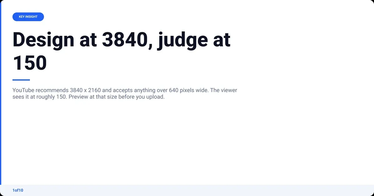
| Format | Aspect ratio | Recommended | Minimum | Size cap |
|---|---|---|---|---|
| Video | 16:9 | 3840 x 2160 | 640 px wide | 2 MB mobile, 50 MB desktop |
| Shorts | 9:16 | 2160 x 3840 | 640 px tall | 50 MB desktop |
| Podcast | 1:1 | square | 640 px | 10 MB mobile, 50 MB desktop |
Whatever size you export, check it at feed scale. The free thumbnail preview tool drops it into a mock home feed and search page so you see what the viewer sees, next to the competition.
Frequently asked questions
How do you make a catchy thumbnail?
Pick one subject, give it one readable emotion or result, add at most four words the title does not already say, and push the contrast until it separates from the thumbnails around it. Then shrink it to 150 pixels wide. If the point survives the shrink, it is catchy; if it needs a zoom, it is not.
What should I make thumbnails on?
Any editor that exports a 16:9 JPG or PNG works: Photoshop, Affinity Photo (free), Canva, or a phone app. 1of10's thumbnail editor and resizer come with a paid plan, the fonts guide is free, and every plan includes the AI thumbnail generator on credits. The tool matters less than the reference: start from an outlier in your niche, not a blank canvas.
What are good gaming thumbnail ideas?
Gaming follows the tech and vlog patterns combined: one character or item large on a clean background, a reaction face in a corner, and a single number or word (a rank, a wager, "banned"). Split-screen "before the patch, after the patch" works for update videos. Avoid the full gameplay screenshot; at feed size it turns into noise.
Do thumbnail ideas for YouTube Shorts work differently?
Yes. Shorts thumbnails are 9:16 and mostly appear on your channel page and in search, not the Shorts feed, where the first frame plays instead. Design the vertical thumbnail as a poster for browsing: face or subject in the top two-thirds, text low, since the title overlay covers the bottom of the frame.
Can AI generate thumbnail ideas?
It can generate the options; the idea should still come from data. The 1of10 thumbnail generator takes an outlier thumbnail from your niche as the reference and builds variants around your subject, so the structure is proven before you spend a credit. A thumbnail costs 4 credits on any plan. Searching outliers and winners never uses credits.